|
Don't forget to read our first blog on The Parade design options which discusses the carriageway
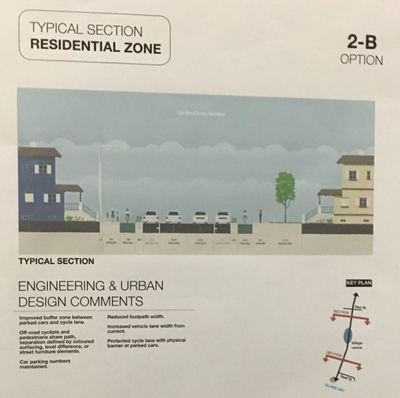
The design options for The Parade are now posted on the Love the Bay website. You have until 9pm Sunday 28 May to provide feedback. This blog assesses the shopping centre design options against the design statements. Thanks to James for doing most of the heavy lifting on this one. The following document shows the five cross sections for the shopping centre options side by side (four new plus the current/original). This is a much easier way to compare the options against each other and spot consistent issues or themes. Summary Option 1B is the clear winner for cyclists, with protected space to cycle. It also maintains a comfortable roadway width for traffic, and keeps footpaths dedicated to pedestrians. The only downside is the reduction in roadside parking as parallel parks fit slightly fewer cars per distance than angle parks. There will no doubt be a loud and negative reaction from many business owners regarding any reduction in parking. That would be a real shame and hopefully retailers will try to keep an open-mind and consider two things:
Bike customers live locally, they bike locally and they are much more likely to shop locally. They shop more often, for longer and they leave parking free for customers in cars
Of the other options:
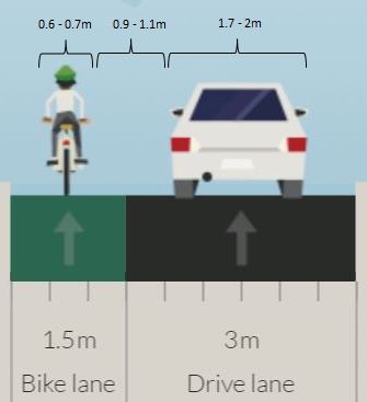
It should also be noted that every single one of these options (including the current layout) will require a significant change in mentality by all users to make the shopping centre work as a truly shared space, which is the clear intent of the design statements. It is anything but a shared space at the moment. Let's look at each option in turn, starting with Option 1E - the current layout. Option 1E - current Sharrows painted through the shopping centre are only partly successful at helping cyclists take the lane. Drivers often overtake cyclists through this area, and typically expect them to move out of the way (rather than overtaking in the other lane when there’s a gap in the traffic). The traffic volume means that despite the 30km/h limit, sharrows aren’t enough to make this section of road feel welcoming for anyone but a confident cyclist. The removal of traffic calming cushions at the southern end of the shopping area means that speeds are often over 30km/h in that area, just where people on bikes need to merge with traffic. Angle parking means drivers leaving a park need to back out part way into the traffic before they can clearly see around other vehicles - especially when a van, ute or truck is parked to their left. This causes a particular problem if cyclists are forced to the left rather than taking the lane where they are more visible. People searching for an angle park may spot one at the last moment as they pass a long parked vehicle ‘hiding’ a space. These sudden left turns can be dangerous for cyclists. Many vehicles turn into and out of Medway Street - a movement across the path of people cycling along the Parade. Pedestrians suffer from the lack of crossing priority. Better priority for people on foot or on bikes across this intersection would improve safety and make the area feel more welcoming to people not in cars. Overall, these features mean someone using the cycleway encounters an abrupt drop in comfort and safety when they reach the shopping area. The knowledge of this may deter families or less-confident cyclists from using the whole cycleway. This option performs poorly against the design statements on safety and separation. Option 1A 1A provides a protected path for cyclists through the shopping area and is generally well aligned with the design statements on safety and separation. However, keeping the angle parking (for capacity?) reduces the width available for adding the bike lanes, and the sub-2m footpaths are likely too narrow to allow for bins, post boxes and other facilities. Vehicles using the angle parking will be over a metre closer to the traffic flow - a hazard for passing traffic or cyclists on the road, and more stressful for drivers leaving parks. Longer vehicles may not even fit those parks - a double-cab Hilux ute, for example, takes up over 5.6m of corridor width when angle parked, so it would stick out over half a metre into the 3m traffic lane. Other comparable parking/lane-width situations in Wellington often result in parked utes or vans sticking out into the traffic lane. Passing vehicles then swing into the oncoming traffic lane to pass them. Implementation detail will be important - determining whether the cycling area feels like a separate path (height and colour - difference would both be important) or part of the footpath. If there’s not much separation, mixing of cyclists and pedestrians would reduce safety and comfort for both. The protected path is narrower than the current cycleway, at 1.5m. If the cycle path is vertically separated from the footpath there’s not much space for cyclists to avoid pedestrians who move into the protected path, for example when loading or unloading a car or van. Option 1B 1B has the same basic benefits for cyclists as 1A. The change from angle to parallel parking is the most significant. In return for reducing the number of parking spaces, all users have more space which aligns well against the design statements on safety and separation. A 1.8m bike lane allows more room to comfortably bike past, for example, someone loading a car. The footpath and roadway are both wider. The road lane width is the same as today - without a median, but also without angle parks to worry about. There will no doubt be a loud and negative reaction from many business owners regarding any reduction in parking. That would be a real shame and hopefully retailers will try to keep an open-mind and consider two things:
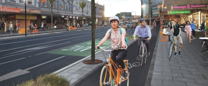
It's worth noting that the layout proposed in Option 1B is basically identical to the new layout proposed for Karangahape Road in Auckland, which has met with widespread approval. The only difference is that on K Road the parallel parking will be used as bus lanes during peak hours. Option 1C 1C relies heavily on a shared path arrangement to make room for angle parking. A shared path is likely to have poor outcomes for pedestrians and cyclists in such a busy environment. Without separated space, people cycling could be moving in either direction and could be anywhere across the path, including right next to business doorways or parked cars. Retaining the angle parking makes the road unwelcoming despite the sharrows, so even competent cyclists may try to ride on the shared path, probably too fast for comfortable sharing.
Option 1C effectively allows cycling right across the road and the path, without making either of them suitable environments. On the road, cyclists are mixed among traffic. On the footpath, the roles are reversed and pedestrians would suffer. Shared paths are The Hunger Games of urban transport. Pedestrians and cyclists are thrown together in a hostile environment to fight over the breadcrumbs left by cars and see who survives. They are effectively a self-sabotaging form of infrastructure. The more popular shared paths become the worse the level of service gets for both modes, which then undermines uptake. Option 1D 1D suffers from many of the same drawbacks as 1C, but adds a new hazard. The on-road painted cycle lanes appear to give cyclists some dedicated space, but they are narrow and beside minimum-width traffic lanes. There’s no room to move if a wide vehicle encroaches into the bike lane, and large vehicles like buses would often pass centimetres from a cyclist's handlebars. With Option 1D, drivers would not be happy to share the main roadway with confident cyclists even though that would be a safer position than in a narrow unprotected bike lane. The bike lane passes behind the short angle parks, so as with 1C vehicles would likely protrude into the bike lane, forming a pinch point for riders. The proposed 0.6m buffer between the bike lane and angle parking also goes against NZTA guidance to have at least a 2m buffer between angle parks and a cycle lane. This is a complete fail against the design statement that "the look and feel reinforces and highlights road rules and protocols". James and Regan Don't forget to read our first blog on The Parade design options which discusses the carriageway
2 Comments
A big thanks to everyone who has already read my blog post The Parade design options - carriageway, which takes an in-depth look at the six design options proposed for main carriageway along The Parade. If you haven't had time to read it yet here's the shorter tl;dr (too long, didn't read) version.
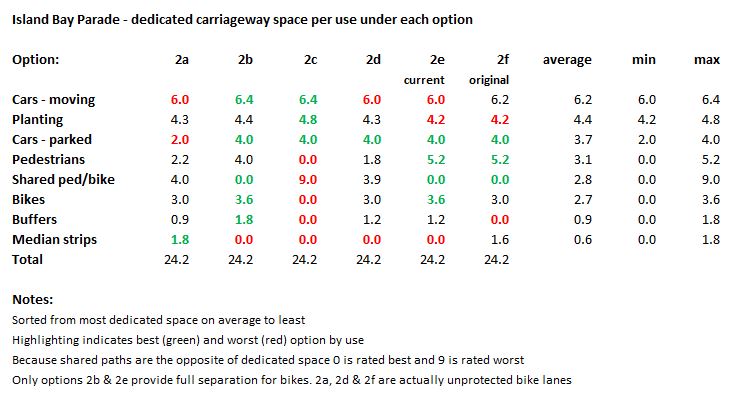
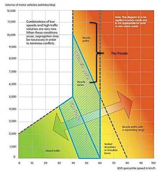
The design options for The Parade are now posted on the Love the Bay website. You have until 9pm Sunday 28 May to provide feedback. Assessing the carriageway options against the design statements it seems clear that options 2b and 2e (current) provide the best mix of 'something for everyone'. Who gets what? The table below highlights the amount of space that's dedicated to a specific use under each option. It's sorted by the average amount of space allocated to each use across all the options to give a sense of which uses are consistently consuming the most space. The green highlighting indicates the best option(s) by use and the red highlighting indicates the worst option(s) by use. If your eye is immediately drawn to option 2b it should be. Looking purely at dedicated space the two options that appear to have the best mix of 'something for everyone' are 2b and to a lesser extent 2e (current). Option 2b is the best possible option for cars (moving and parked) and bikes. It's also the second best option for pedestrians. Option 2e (current) is the best possible option for pedestrians, bikes and parked cars and the third best option for moving cars (but only 40cm less space than the best option). If we decide to prioritise pedestrians and bikes above cars then the current layout (Option 2e) should be preferred. Are shared paths the answer? Options 2b and 2e (current) don't require pedestrians and cyclists to share space. Shared paths are a poor solution because they mix pedestrians and cyclists moving in different directions and at quite different speeds. If there is any aspiration at all that the new design should increase active transport numbers then shared paths will become an increasingly sub-optimal solution, and may actually end up having the opposite effect. Shared paths do not score well against the design statements on safety, separation and "accommodating all current and future users" . If it's not OK to walk it, why is it OK to cycle it? Options 2b and 2e (current) are the only options that provide cyclists with full separation from moving traffic. This includes not requiring cars to cross the bike lanes to get to street parking. Lack of separation from moving traffic dramatically increases both the likelihood and consequences of a cyclist having a crash. More significantly, it's also the main cause of the 'near misses' that are proven to make cyclists feel uncomfortable and suppress uptake of cycling and there is a mountain of research to support this point. NZTA guidance also requires complete separation between cyclists and moving traffic on roads with more than 7,000 vehicles per day, which is nearly the entirety of The Parade. In the three options where cyclists are required to ride in an unprotected bike lane next to moving traffic (2a, 2d and 2f) the bike lanes are 1.5m wide, which is too narrow. This means there will be many occasions where a cyclist is being passed by cars that are well within the 1.5m minimum safe passing distance recommended in the NZ Road Code and the 1m distance under 60kph recommended by the Cycling Safety Panel as the legal minimum. It should be unacceptable to even consider implementing a design for The Parade where cyclists being close to, and often within, a metre of moving traffic is actually built in. It is an obvious fail against the design statement that says "the look and feel reinforces and highlights road rules and protocols" as well as the design statements on safety and separation. In short, if it's not OK to walk it, why is it OK to cycle it? Is parking really more important than mobility and safety? Only one option - 2a - considers a reduction in the amount of parking. This is despite council data that shows parking occupancy on The Parade is in the region of 50-60%. It's also noteworthy that the design statements make no mention of needing to preserve the current amount of parking, or even retain a minimum amount of parking, except at the shopping centre. Parking uses up a large amount of space that could be used for mobility. It also interrupts sight lines, which creates safety issues, and creates visual and physical clutter. If completely removing parking from one or both sides is just too hard for people to swallow then at the very least it should be possible to remove selected car parks to improve visibility at intersections and driveways, and reduce visual and physical clutter, which aligns very well with the design statements. Conclusion Overall, options 2b and 2e (current) both appear to be well-aligned with the key design statements and I'd like to see the designers focus on a design that builds on the best elements of both of those options. Options for the carriageway that use shared paths or on-road bike lanes should not be developed further. I hope you find this analysis helpful. When submitting your own feedback on the carriageway options I suggest focusing on options 2b and 2e (current) first and clearly describing what you most like about those options. Then go to the other options and focus on what you most dislike about those options. I'll stop short of actually providing template answers to the specific questions because pro-forma responses are not that helpful to the designers and you should really try and explain why you like or dislike a particular option in your own words. Regan
Update: This is a pretty detailed analysis and a long read. If you haven't got time I've now posted a shortened version.
The design options for The Parade are now posted on the Love the Bay website. You have until 9pm Sunday 28 May to provide feedback.
In this blog I'll be assessing the carriageway design options against the design statements. I'll be doing this at a global level, rather than option by option. That's partly because of space and time considerations but also because the key themes and issues are consistent across multiple options. In fact, there are issues that are really only revealed by comparing the options against each other. I think it's useful to analyse these issues at a higher level first before drilling down to individual options. Analysing the options in this way also acknowledges that they are not discrete or set in stone. As explained on the Love the Bay website the designs are not exhaustive, but rather are intended to illustrate a range of feasible options for The Parade in order to prompt discussion and provide context for feedback. The process is not tied to just these options and our job in providing feedback is not to try and whittle down these options to just one. This is not a vote and the designers at Tonkin & Taylor are looking for quality not quantity of feedback. Hopefully this analysis might also help you to provide your own feedback on the options. Even if you disagree with me you can use this analysis as a straw man to conduct your own. After all, the more feedback on the options, and the higher quality it is, the better for the process overall. Before looking at the options themselves I think there's an issue with the design statements that needs to be addressed. As I pointed out in my previous blog Love the Bay - back on track! there's at least two key design statements that I think aren't fit for purpose. The first is the design statement that deals with safety:
It is safe for pedestrians, safe for cyclists, safe for motorists, safe for children, safe for the elderly, safe for people with disabilities, safe when exiting/accessing vehicles while parked, safe for exiting driveways, safe for parking, safe at intersections
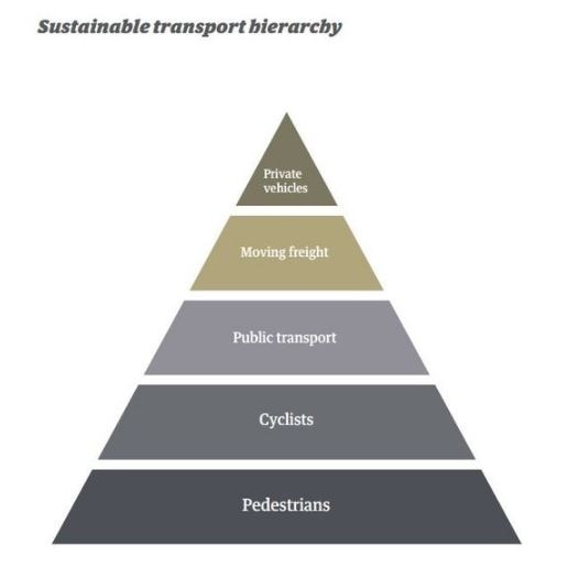
The problem with this statement is that it doesn't differentiate or prioritise between different types of users. It simply states the obvious, that all users should expect a minimum standard of safety. However, it offers no assistance at all in regard to whether certain users need to be prioritised because they are more vulnerable than others, or more likely to be at risk. Neither does it consider whether there are certain users who should be made to feel even safer than others, or simply more comfortable, to achieve a policy goal such as increasing active transport use. For these reasons I am suggesting that as long as an acceptable level of safety is in place for everyone the safety of pedestrians and cyclists should be prioritised above motorists because of their vulnerability and the higher level of risk they face. I'm also taking it as given that the safety of children, the elderly and people with disabilities is the highest priority within each of those groups but that, for example, the safety of a motorist with a disability is not a higher priority than a cyclist without. This prioritisation is consistent with NZTA guidelines and the safe system approach, and also Wellington City Council's sustainable transport hierarchy, which is central to the Urban Growth Plan and the Low Carbon Capital Plan. For the purpose of this analysis it's this revised design statement that I'll be referring to.
The second statement that I find problematic deals with the need for separation:
There is clear separation between fast moving things, slow moving things, and parked things (motorists and fast cyclists / slow cyclists and pedestrians / parked cars)
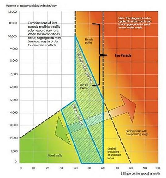
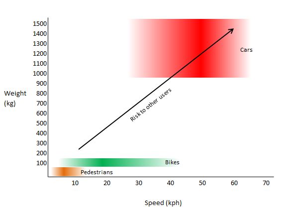
The problem with this statement is that it only considers speed and doesn't account for vulnerability or traffic volumes, as I fully explained in my blog Love the Bay - back on track!. It also fails to consider something incredibly important in relation to speed. There is a much greater range of speed differential between pedestrians, cyclists and motorists than simply fast and slow. Pedestrians typically move at an average speed of around 5kph and would very rarely get above a speed of 10kph, at which point they are jogging. At the other end of the scale cars in an urban environment typically drive at, or close to, the speed limit of 50kph, occasionally dropping to speeds lower than that. Bikes typically travel at a speed of around 20kph on the flat but depending on the rider can easily range between a constant speed of 10kph and 30kph, and on hills can go even slower or faster than that. It's actually a key part of the utility of bikes that they suit such a wide range of users and needs. However, this means that bikes and their riders can't be categorised as just being fast or slow. Also, the speed at which bikes typically travel, between 10kph and 30kph and an average of 20kph, puts them right between the top of the range for pedestrians and the bottom of the range for motorists. Essentially, most bikes are going too fast to be sharing with pedestrians and too slow to be sharing with cars as I've illustrated in the graph below. The graph also highlights the issue of vulnerability and the vast difference in mass between pedestrians and cyclists, and cars, trucks and buses (which weigh a minimum of one tonne and can go up to 15 tonnes or more).
For these reasons I'm suggesting that this design statement be revised to simply say that there should be clear separation between pedestrians, cyclists and motor vehicles. For the purpose of this analysis it's this revised design statement that I'll be referring to. To aid this high level analysis I've also created the following document which shows the six cross sections for the carriageway options side by side (four new plus the current and the original). I find this a much easier way to compare the options against each other and spot consistent issues or themes.
The first point to note is the continued dominance of cars over other modes. In every single option cars are allocated the most space, particularly when parking and median strips are included. Highlighting this issue isn't just abstract, tree-hugging, "cars are bad" rhetoric. My family owns a car and we use it quite a lot. However, it needs to be acknowledged just how dominant the private motor vehicle has become in our urban transport ideology and infrastructure so that a greater degree of status quo bias than already exists doesn't creep in. Cars are currently so far ahead in their dominance that if we are sincere about wanting a 'balanced' transport network walking, cycling and public transport need to be prioritised for a long time in order to get even remotely close to equity. The table below quantifies how this issue affects The Parade by showing the amount of space that's dedicated to a specific use under each option. It's sorted by the average amount of space allocated to each use across all the options to give a sense of which uses are consistently consuming the most space: On average cars consume nearly three times the space of pedestrians and cyclists when parking and median strips are accounted for. There's also a much greater range of space allocated to pedestrians and cyclists across the options than there is for cars. The range of possible outcomes for pedestrians goes from no dedicated space at all under option 2c up to 5.2m of dedicated space under options 2e (current) and 2f (original). The range of possible outcomes for cyclists goes from no dedicated space at all under option 2c up to 3.6m of dedicated space under options 2b and 2e (current). However, the range of possible outcomes for cars only varies from 6m to 6.4m, or from 9.8m to 11.8m if taking into account parking and median strips. This reinforces the view that dedicated space for cars is considered not-negotiable, while dedicated space for pedestrians, and cyclists in particular, is a 'nice to have'. In terms of dedicated space the best option for each mode of travel is:
If your eye is immediately drawn to option 2b it should be. Looking purely at dedicated space the two options that appear to have the best mix of 'something for everyone' are 2b and to a lesser extent 2e. Option 2b is the best possible option for cars (moving and parked) and bikes. It's also the second best option for pedestrians. Option 2e (current) is the best possible option for pedestrians, bikes and parked cars and the third best option for moving cars (but only 40cm less space than the best option). If we decide to prioritise pedestrians and bikes above cars then the current layout (option 2e) should be preferred.
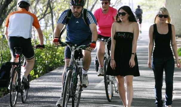
Option 2e (current) in action
There's also an over reliance in the options on shared paths as a panacea. Three of the four new options - 2a, 2c and 2d - all rely on shared paths. Shared paths are a poor solution for both cyclists and pedestrians because they lower the level of service for both modes. As explained above they do not align well with either of the design statements regarding safety and separation because they mix pedestrians and cyclists who are potentially travelling at quite different speeds. Remember, an average pedestrian is travelling at 5kph while an average cyclist is travelling at 15-20kph. Options 2b, 2e and 2f are the only three options where pedestrians and cyclists don't have to share the same space. This further strengthens the case for options 2b and 2e, or some variant of, to be considered the preferred options.
Options 2b and 2e are also the only options that provide full separation for bikes. Bikes are required to ride in unprotected lanes in three options (2a, 2d and 2f) and fully in the traffic lane in option 2c. There are multiple issues with on-road bike lanes:
The multiple problems with the on-road bike lanes in options 2a, 2d and 2f can be neatly summed up by asking a very simple question: if it's not OK to walk it, why is it OK to cycle it? Cyclists are just as vulnerable to motor vehicles as pedestrians so if you wouldn't want to walk on the road between parked cars and moving traffic why would you expect cyclists to bike there? Options 2b and 2e (or some variant of), which separate cyclists from moving traffic completely, make another strong showing here.
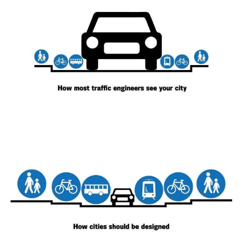
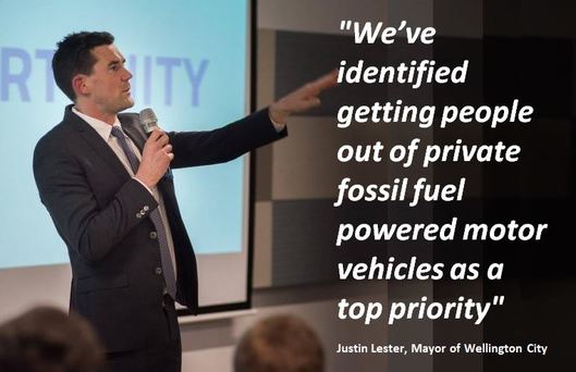
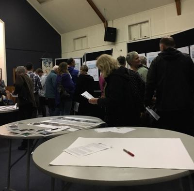
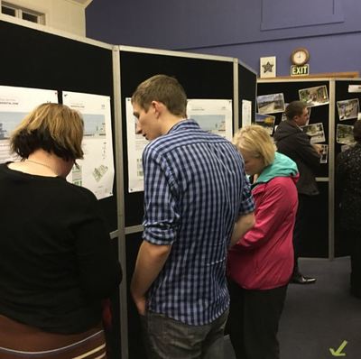
It also sticks out like a sore thumb that only one option - 2a - even considers a reduction in the amount of parking. This is despite council data that shows parking occupancy on The Parade is in the region of 50-60%. It seems surprising that the removal of at least some parking doesn't feature more heavily among the options especially when parking would score very low against the design statements. In fact, it's noteworthy that the design statements make no mention of needing to preserve the current amount of parking, or even retain a minimum amount of parking, except at the shopping centre. Parking uses up a large amount of space that could be used for mobility. It also interrupts sight lines, which creates safety issues, and creates visual and physical clutter. Even The Economist magazine recently pointed out that cars are parked 95% of the time and parking is mostly "a public resource being allocated highly inefficiently". I realise that some residents rely on street parking but if we are really saying parking is more important than safety or mobility then I think we've got our priorities wrong. The fact is that the parking occupancy stats indicate parking could be removed from one side of The Parade without creating a huge problem. There are also tools such as residents' parking schemes and the rise of park-sharing apps that could help mitigate the impact. Unbelievably, in option 2a the space freed up by removing parking on one side is allocated to a median strip but it could be much more usefully deployed to make the footpaths, bike lanes or traffic lanes wider. If completely removing parking from one or both sides is just too hard for people to swallow then at the very least it should be possible to remove selected car parks to improve visibility at intersections and driveways, and reduce visual and physical clutter, which aligns very well with the design statements. The re-introduction of median strips to options 2a and 2f (original) is also very disappointing. In my view median strips and right hand turn bays generally reflect an old-fashioned attitude that traffic flow is more important than anything else. This is a view that simply isn't necessary or appropriate in a modern suburban environment. When it's been proven that narrower traffic lanes slow traffic down and make streets safer overall narrow lanes should be considered a feature in the suburbs, not a problem. Let's also not forget that Wellington City Council's own policy is to reduce the number of private fossil fuelled vehicles on the road. This recently published and well researched article End of the road? Why it might be time to ditch your car argues that "peak car is upon us, and with it comes the opportunity to choose new models of urban transport that better match our current needs for quality, sustainable living". So when one of the design objectives is for The Parade to "accommodate all current and future users" that's the future we should be planning for. Prioritising traffic flow also isn't consistent with a more progressive view of how urban environments can be designed to make them more liveable and people-friendly, a desire that is reflected in many of the design statements. The 'futurementary' below from Bike Te Atatu is a brilliant example of the kind of 'complete streets' or 'complete community' that we could be aspiring to be in Island Bay if we had the vision, imagination and optimism. In summary, options 2b and 2e seem to provide the best mix of 'something for everyone'. Out of all the options they provide the greatest amount of dedicated space for pedestrians (2e), cyclists (2b, 2e), moving cars (2b) and parked cars (2b, 2e). They don't require pedestrians and cyclists to share space and they provide cyclists with full separation from moving traffic. This includes not requiring cars to cross the bike lanes to get to street parking. Options 2b and 2e also retain parking on both sides of the road. However, this is one area where the options could be developed further. Removing some parking could create more space for pedestrians, cyclists and moving cars. It could also increase visibility and reduce visual and physical clutter. Overall, options 2b and 2e both appear to be well-aligned with the key design statements and I'd like to see the designers focus on a design that builds on the best elements of both of those options. If time permits I'll try and blog about the other elements of The Parade sometime over the next two weeks. If you are pushed for time to give feedback I suggest focusing on the carriageway options first and Options 2b and 2e in particular. The carriageway options will dictate what you see on the ground along the bulk of The Parade and if we get that right then to a large extent many of the other elements will fall into place. Regan Here's a few thoughts on the recently completed Love the Bay drop in sessions. On the bright side the sessions were pretty well attended, especially compared to the workshops. I would guess that approx. 150 people went along on a wet Wednesday night and even more than that on Sunday, with maybe 200+ people coming through. However, there were a lot of familiar faces from the workshops so it's hard to know how many new people the drop-in format brought out. Even with making some generous assumptions about that it's hard to see how the drop in sessions have increased the overall engagement of Island Bay residents in the Love the Bay process much above the 5% mark. It's clear that while people at the more extreme ends of the debate have been well involved the process simply hasn't engaged the vast majority of the community. Active transport was a popular option at both drop in sessions The downside of the reasonably good turnout was that it was quite crowded on both days and difficult to get a look at all the information on display. That problem was compounded by the sheer volume of information to look at and provide feedback on, most of which was quite technical. These were not "drop in" sessions by any stretch of the imagination. There were five different stations around the room each with four or more options to assess against the 32 design statements. For every option the feedback forms asked you to consider the advantages (what about this option will work well?), the disadvantages (what about this option will work poorly?) and ideas (how could this option be further developed?). Even if you didn't bother with trying to assess every option against every design statement you still faced filling in 20+ feedback forms and answering 60+ questions. It was obviously just too much for many people who I suspect defaulted to trying to push their preferred outcome without any real regard for the information being presented. That's a massive missed opportunity. Island Bay residents working their way through a large amount of information Unfortunately this was just the wrong format for what was being asked and it reinforced my view that the workshops phase of the Love the Bay process has been prematurely concluded. This is the part of the process where the rubber hits the road (no pun intended) and the hard work of deciding priorities and making trade-offs, including financial ones, needs to occur. Getting groups of residents together to discuss the all the pros and cons of the various options with facilitation and guidance from technical experts could have worked really well. At the very point where the real value of a participatory process should have been most evident it feels like it's been cut off at the knees. There also appears to be some confusion about what will happen with the feedback that was collected. Many people still seem to be under the impression that this is a numbers game and that the feedback forms are effectively 'votes'. However, the council staff I spoke to were absolutely clear that this is not the case and it's quality not quantity of feedback they are after. That's really important because... There will be another opportunity to provide feedback online. If you weren't able to attend the drop in sessions or you want to supplement the feedback you've already given, you can. Keep an eye on www.lovethebay.nz over the rest of this week. Given the volume of information to consider taking some time to work through the options in the peace and quiet of your own home is probably the way to go. Hopefully the feedback period will be long enough to give the kind of quality feedback being asked for. Regan |
Archives
October 2022
|








 RSS Feed